


A PERFECT SUMMER IN THE CITY
- Daya Zaman

- Mar 16, 2019
- 2 min read
Updated: Mar 21, 2019
Have you ever been wonder what's the best place to spend your Summer? Copenhagen, Denmark has been chosen as top list for a perfect summer!


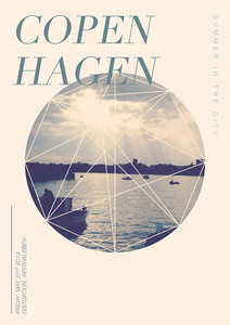
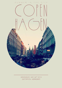
Copenhagen, Denmark is said to be the best and wonderful place for spending the summer. The fact that the days get longer, the sun gets brighter, the weather gets warmer, and the whole city is buzzing with life will embrace you a better summertime ever. According to Christopher Juul, there are three posters of the festival been published as tribute to the city where the summer is the best.
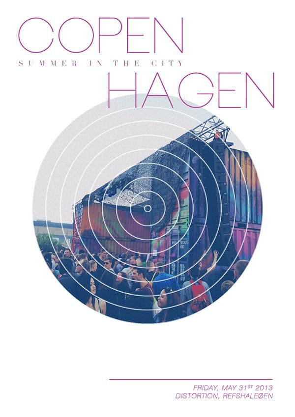
This is one of the poster does contain all basic elements of design to have a good design. These basic elements are line, shape, size, color, contrast and texture. I believe that these three different posters does portray different moods and vibes to every single person who sees it.
First and foremost, to find line element in the designated poster, line is something that mark which connecting two points. As we can see in this poster, there is one straight line above the text that mentioned day, date and the event took place. In this poster, this straight line is a basic one.
Next is about the shape. A good design does contain shape which can be a boxes or any borders for decorating purposes. We can clearly see that there is circle shape as the center of the poster that have been masking with the picture.
Furthermore, the size that can be differentiate either small or large including the size of visuals or shape. This is very important as we have to ensure that our focal point is the main attraction for the public. For example, the focal point here is the event that only held on summer in Copenhagen, Denmark called 'Summer in The City'. So, the designer wants to inform the public that an big fiesta or event will be held, soon.
Besides, color does play an important part in designing because it helps to convey moods or attract the public attention as long as the poster itself shows a good color combinations. For instance, the neon violet text in the poster does presents an exciting and fun event.
In addition, the poster is considered a good design as there is contrast between the text and the visuals. Last but not least, the texture that used as surface or background of the poster is somehow plain which is very minimal and pleasant to the eyes.


Sources:
https://www.facebook.com/summerinthecityfestival/
https://www.visitcopenhagen.com/copenhagen/7-reasons-why-youll-want-spend-your-summer-copenhagen
https://www.visitdenmark.co.uk/en-gb/copenhagen/summer-copenhagen


Comments